Visual identity
Color scheme
The application is themed by a theme with two main colors:
- Theme: the theme color.
- Accent: the contrast color.
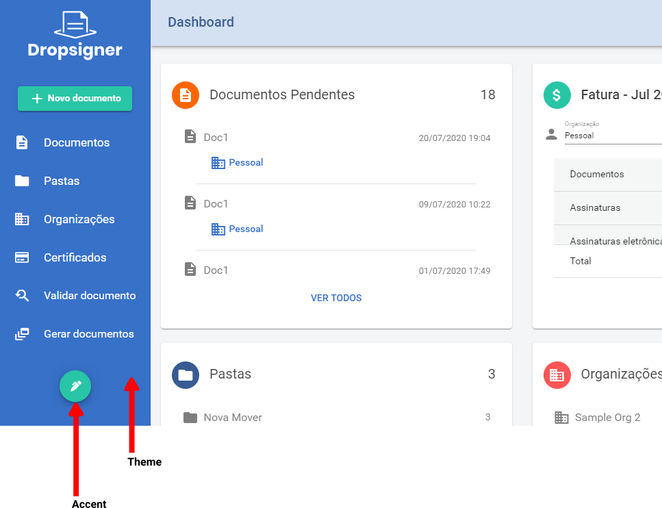
Each theme is identified by a three-letter code, such as acr for amazon-cornell-red. The complete
list is in Available themes.
To change your instance theme, give the desired code to the deployment team.
If none of the themes fit, a new theme can be created for you. Just tell us the desired theme and accent colors.
The same three-letter code is used to theme the Embedded Signature widget.
Logos
The application uses four logo files, served under /theme-assets/:
| File | Where it shows up |
|---|---|
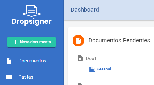
light-logo | On dark backgrounds, in the side menu and top bar of the authenticated area, and as the default e-mail logo |
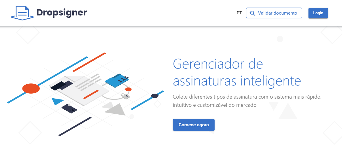
dark-logo | On light backgrounds, in the public area header and the external screens |
stamp-logo | Default logo of the printer friendly version (signatures manifest) |
val-stamp-logo | Default logo of the validation stamp |
Examples of light-logo and dark-logo:
The files must be handed to the deployment team, who place them in the assets folder of the Blob
Storage configured for the instance, the same place used by the home page files.
After the update, the application must be restarted.
stamp-logo and val-stamp-logo only define the instance default. Each organization can upload its
own logo for the printer friendly version and for the validation stamp with no need for the deployment
team, as shown in Generated documents.